
Dalton Park

A retail destination that warrants something special

…and we were happy to deliver this contemporary brand across multiple assets at the shopping outlet near County Durham

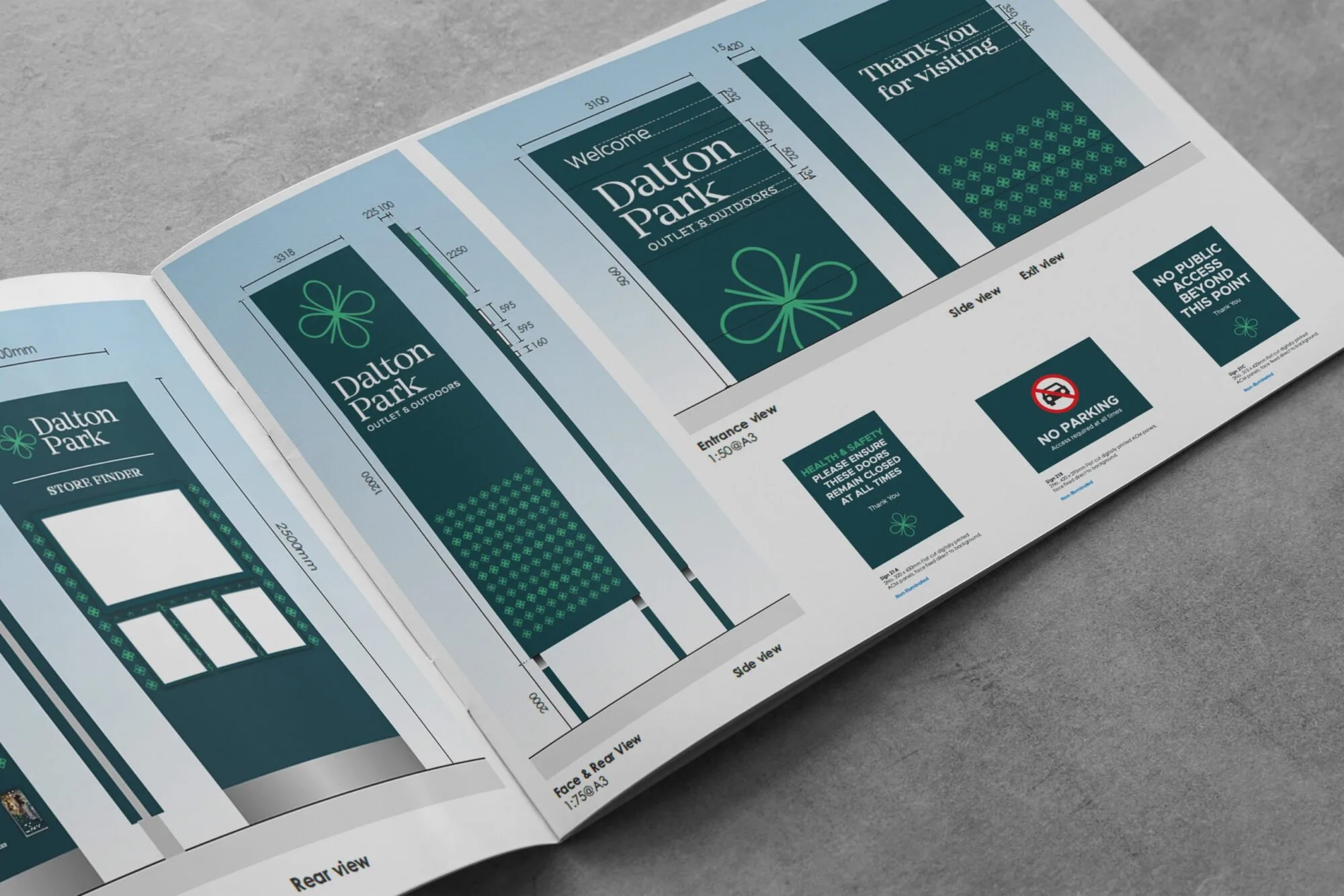
Open booklet showing Daulton Park signage designs with green and white color scheme.

A brand that creates the mood

Dalton Park, a shopping outlet in County Durham, recently achieved full occupancy for the first time since its opening in 2003. And after the application of this new brand into their impressive outlet we aren’t surprised!

Their rebrand journey started in 2018 and resulted in a positive outcome including a 4% increase in like-for-like turnover. Our park was simply to finish off the application into their physical site branding, helping to design and manufacture signage and wayfinding solutions.
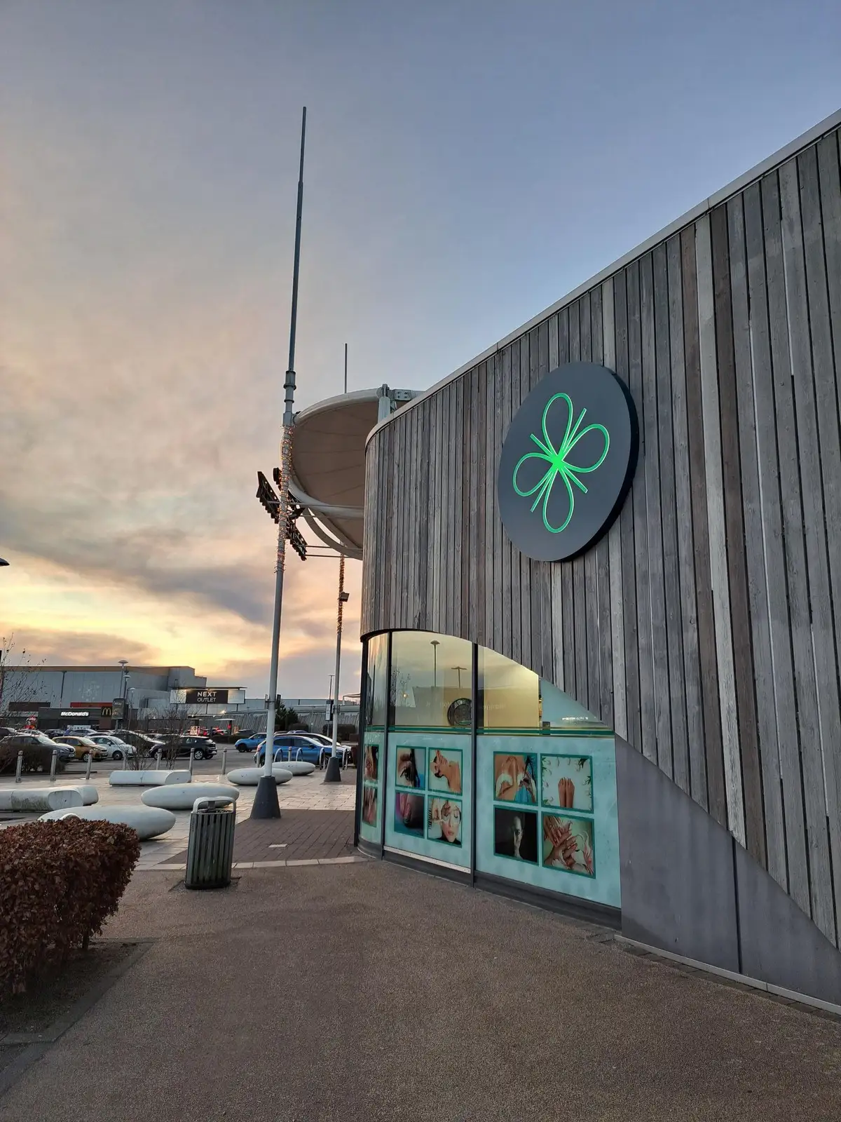
Modern building with a green logo, large windows, and a cloudy sky in the background.

Watch this quick snippet video to get a flavour of how amazing the end result is!

Don't take our word for it - see the results for yourself!

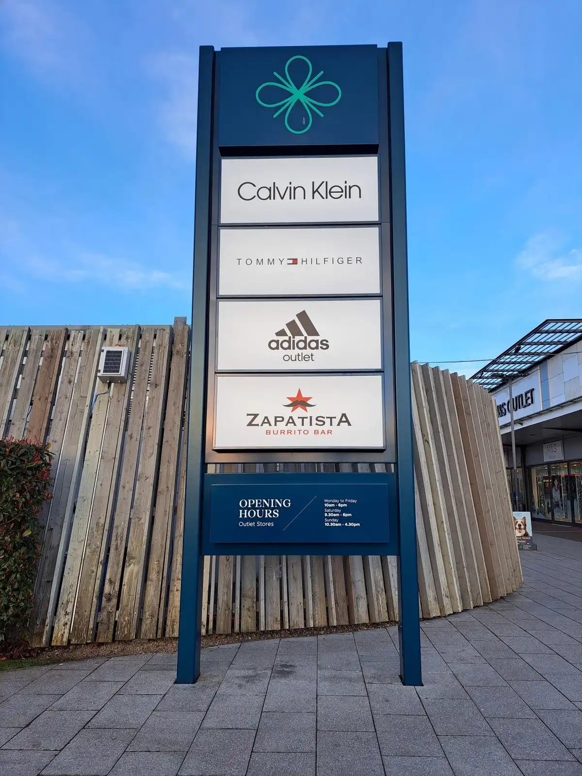
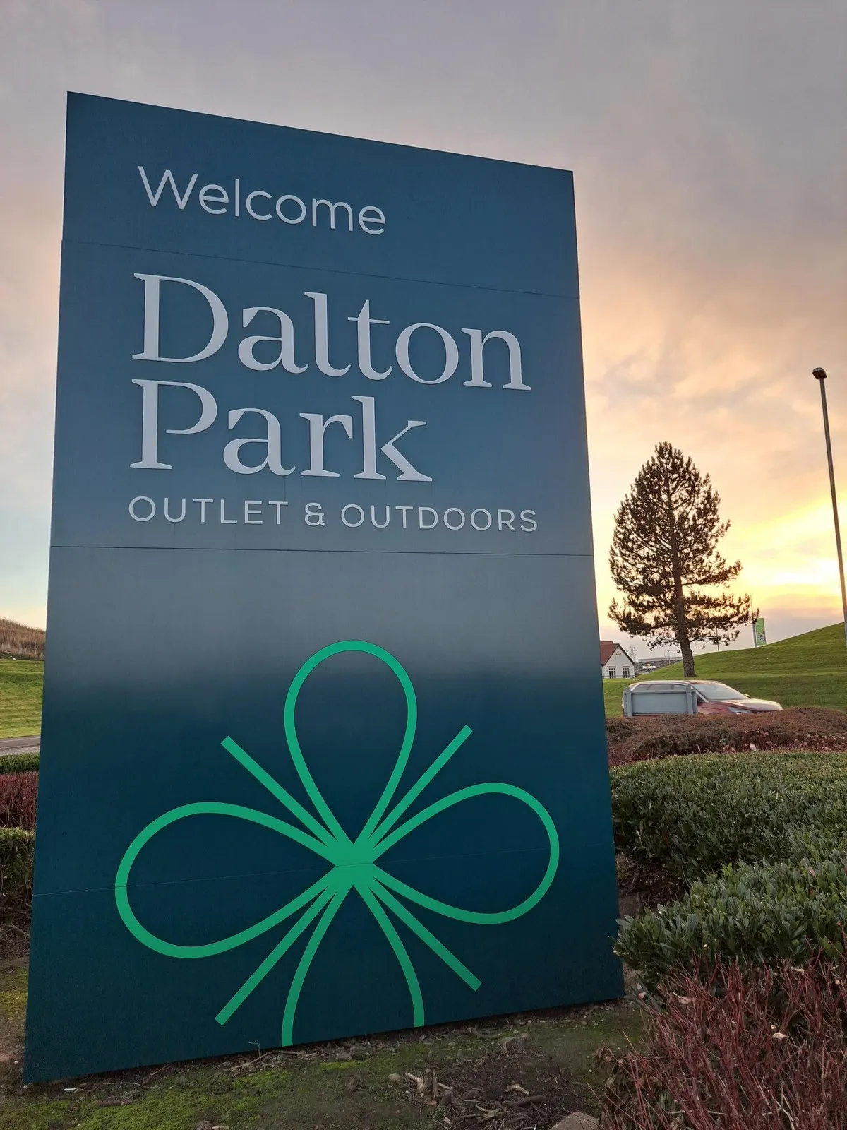
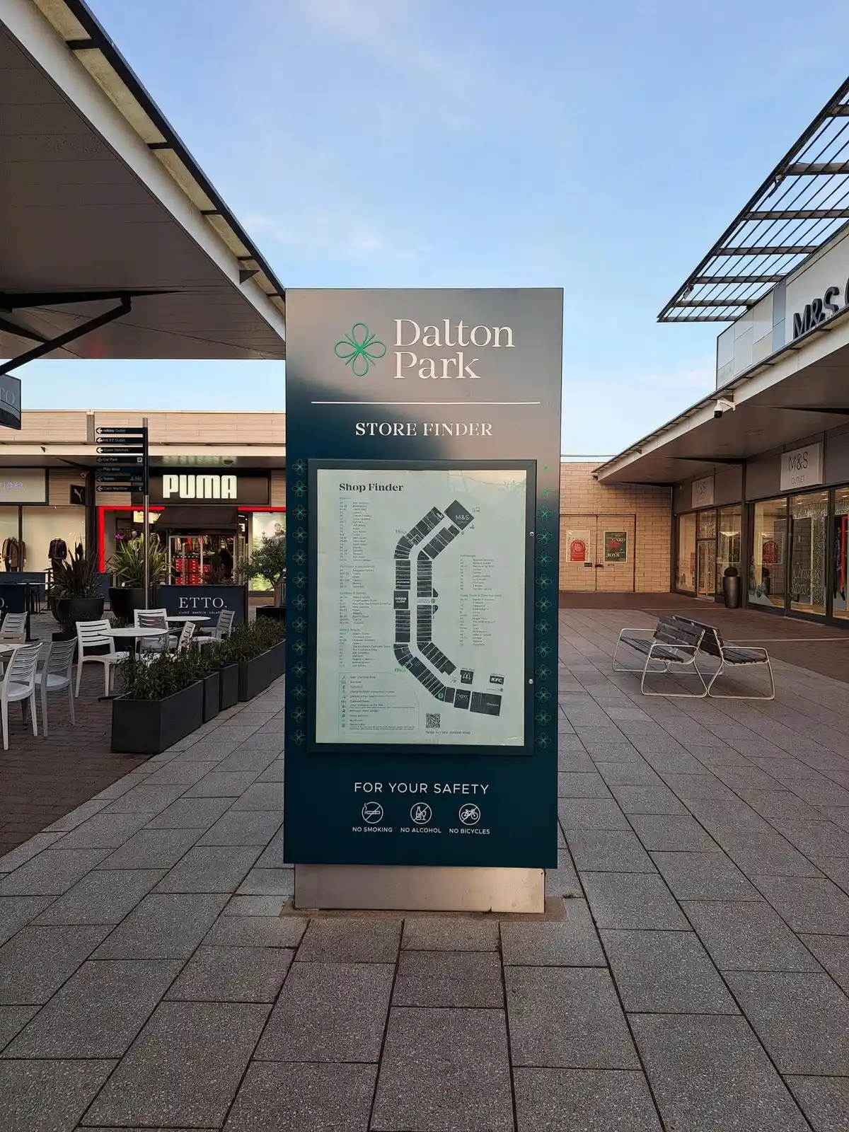
We love how the brand has transferred across the outlet, from totem signs to wayfinders and building signage. A contemporary brand that is rapidly becoming a favourite destination in the region is really celebrated at every touchpoint.

Achieving colour consistency across multiple applications

Ensuring a brand colour is consistently applied across multiple applications and types of asset doesn’t happen without expert intervention.

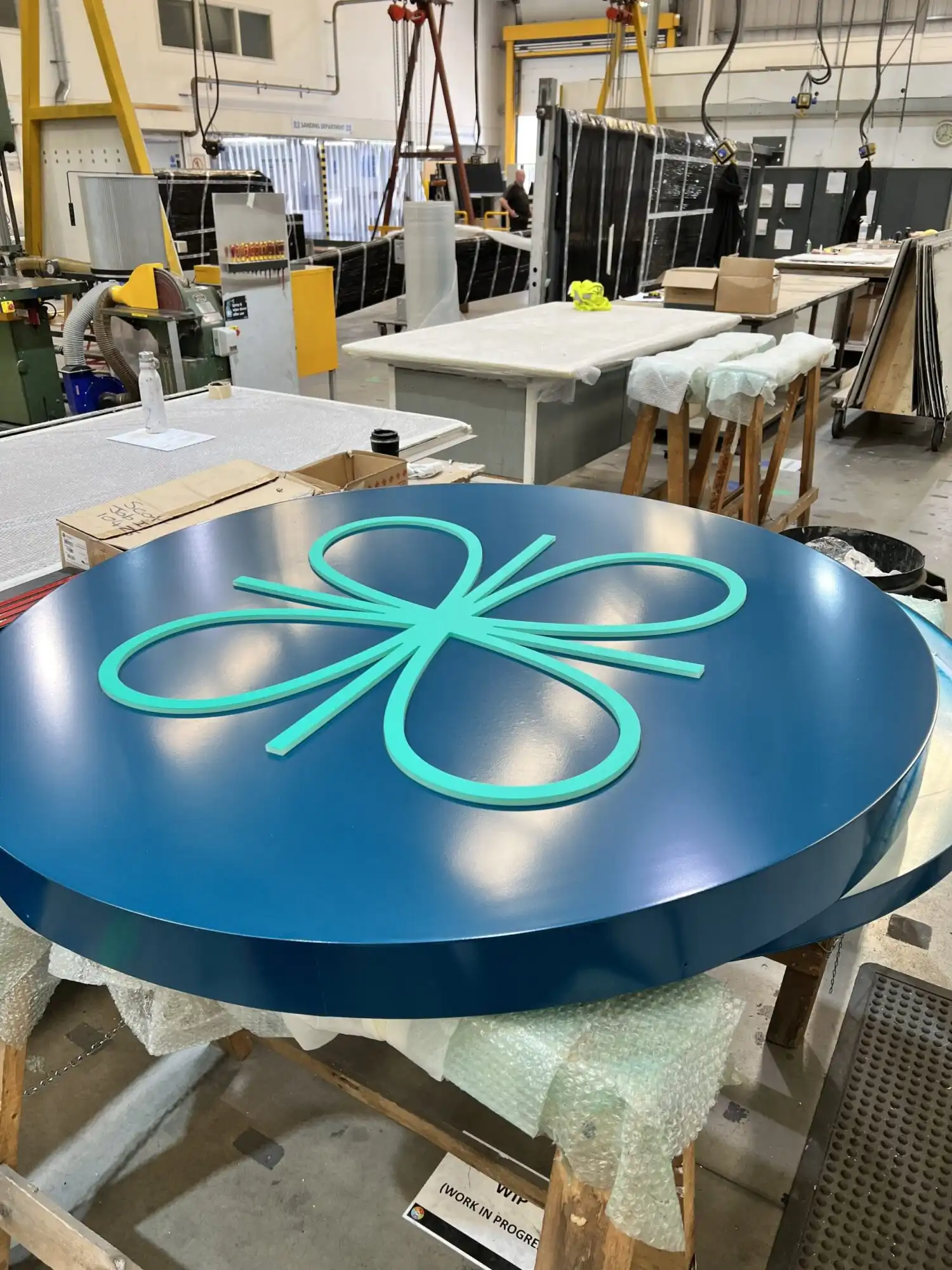
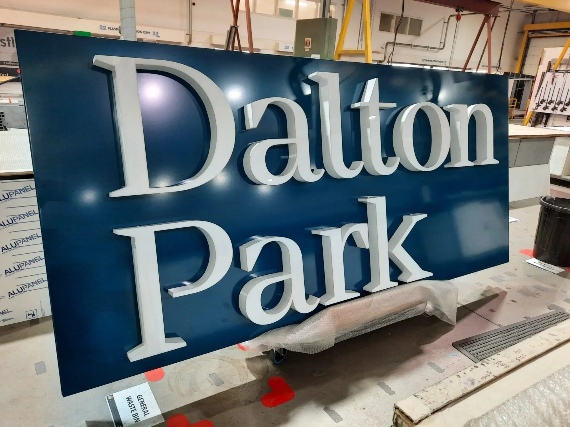
Our in-house design and production teams work collaboratively to ensure that they refer to overarching brand guidelines and any samples made, reviewing colour and particularly colour of illuminated branding, to ensure that the end result is consistent. Blue in particular always proves tricky within this industry but our teams are expert in overcoming this through enhanced knowledge of how materials perform.

Large blue sign with raised white letters reading "Dalton Park" in a workshop setting.

Sustainable solutions to branding

Designs on paper are great…but ensuring they get manufactured and installed safely is critical. Our technical team ensures that large structural elements, such as totems, are expertly engineered with safety as the highest priority.

To offer a more sustainable solution that often proves a more cost effective alternative to the replacement of an entire structure, our team proposed the re-cladding of multiple totems at the outlet, making use of existing totem structures and simply rebranding. We even removed cladding and stripped off old branding to apply new before returning to reinstall. This type of thinking is the ideal way to reduce waste at a site and lessen our impact on the environment.

Related Case Studies

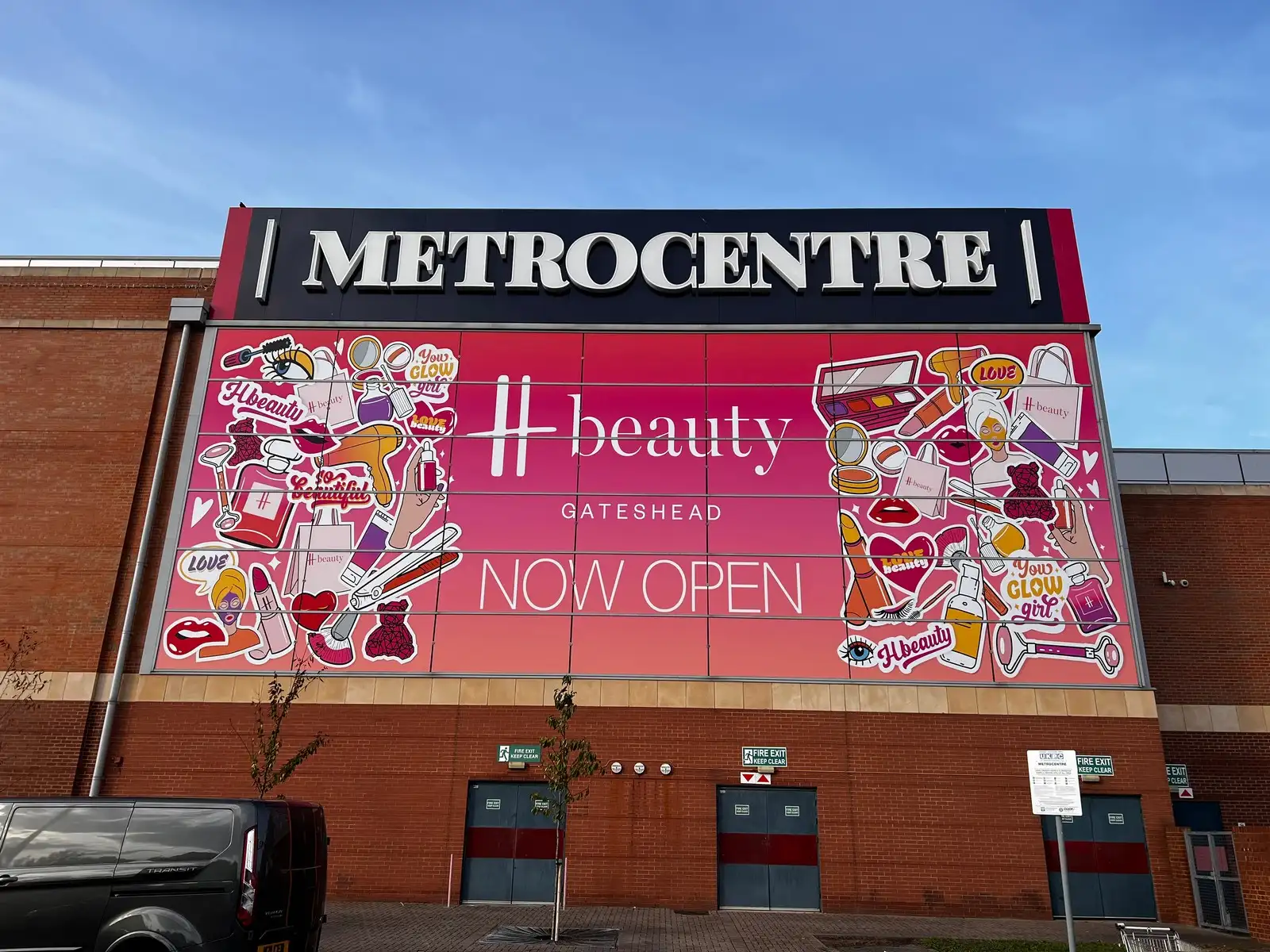
Large "METROCENTRE" sign above a colorful "H beauty GATESHEAD NOW OPEN" advertisement on a brick building.
View client work
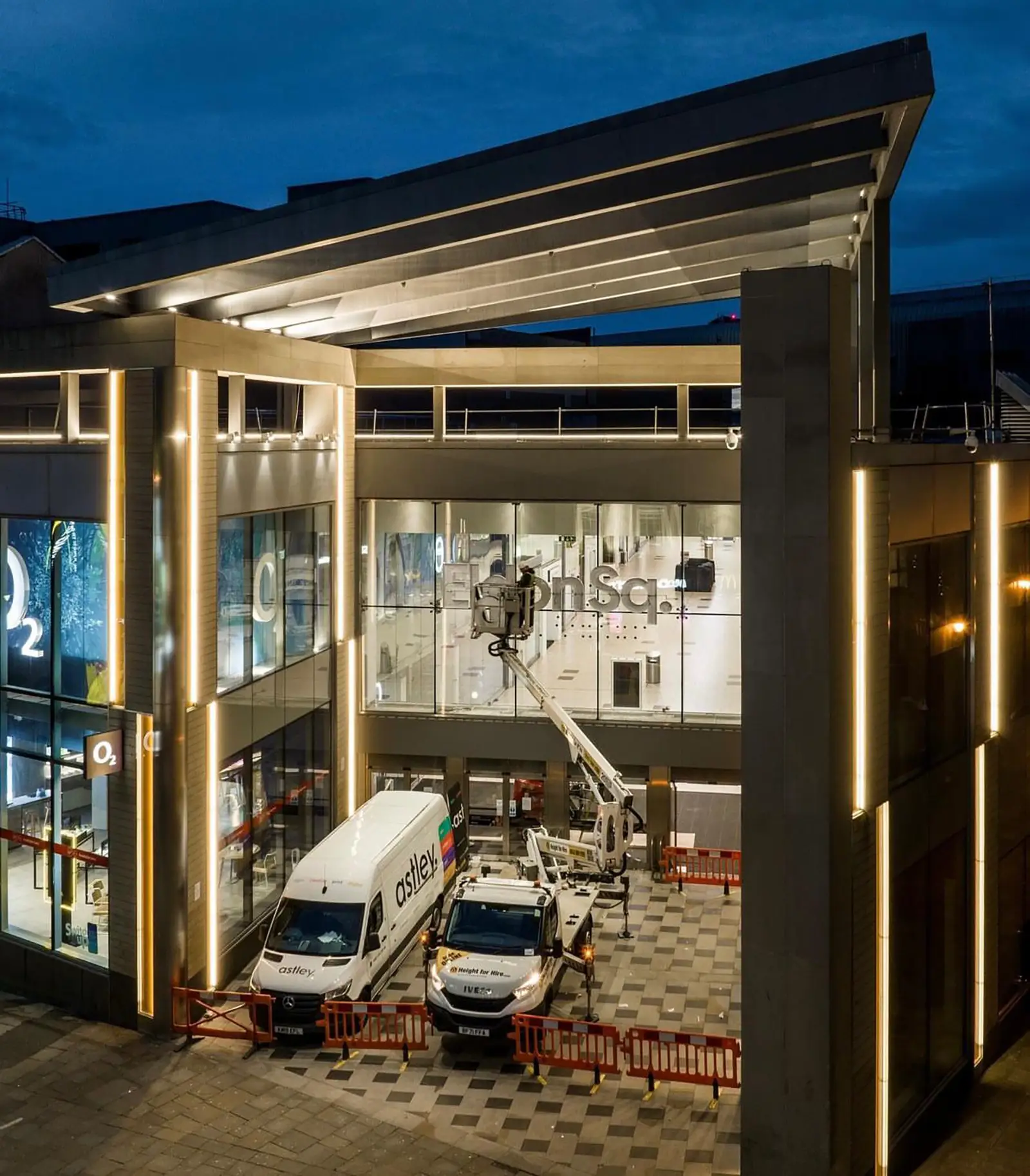
Modern building with illuminated facade, two parked service vehicles, and a cherry picker at dusk.
View client work